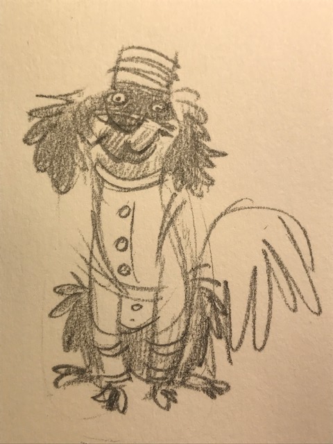
Here’s the painting of Charlemagne. You can watch me paint it in the previous post. Also, if you’d like to receive this Christmas card—let’s face it, I’m listening to Christmas music over here and the decorations are still up—just private-message me your postal address.
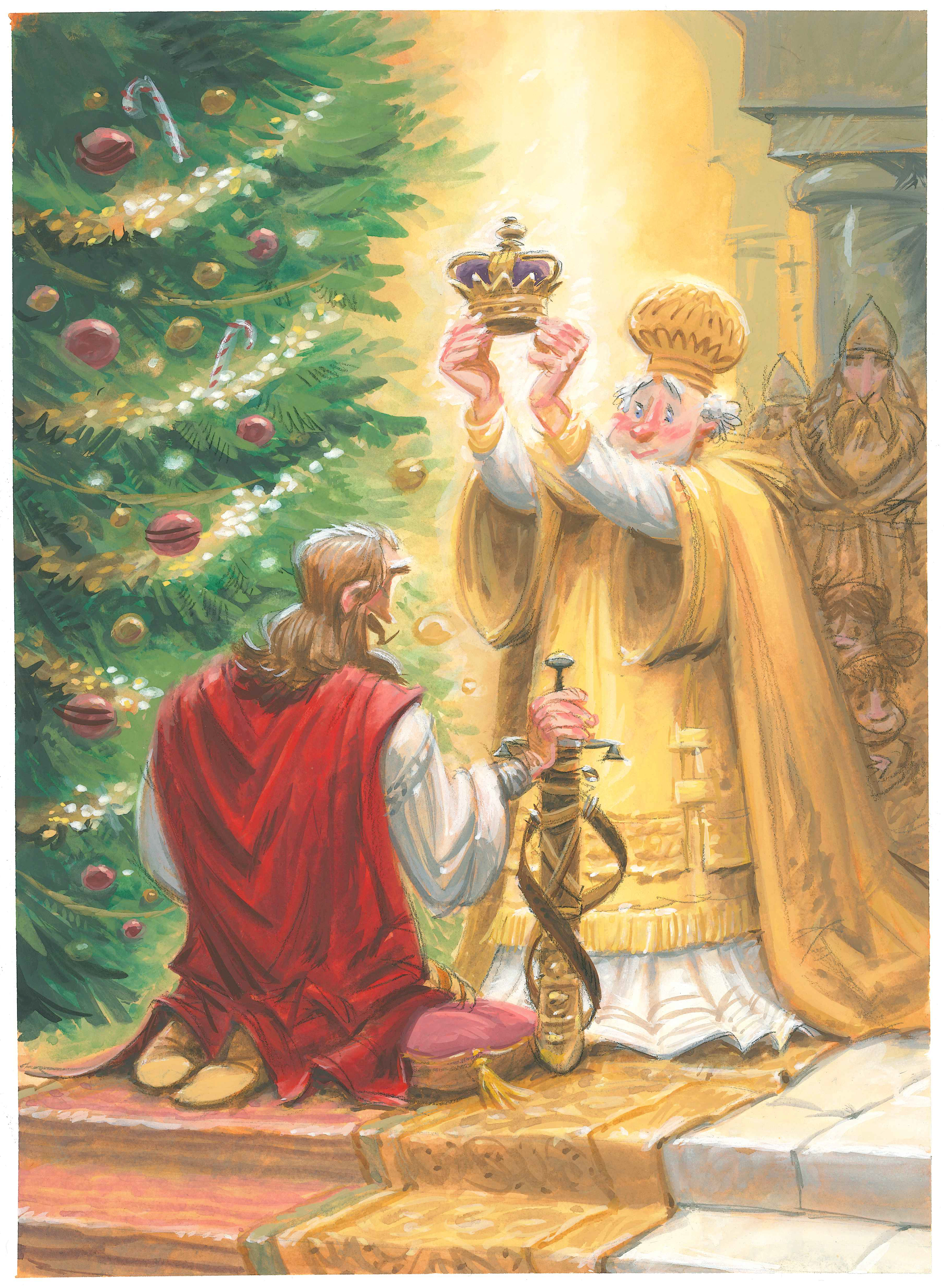
I recorded myself painting the art for this year’s Christmas card. This image is my ham-handed take on The Coronation of Charlemagne, painted in AD 1861 by Friedrich Kaulbach. Charlemange was crowned Holy Roman Emperor by Pope Leo III on Christmas Day AD 800. That painting can be found at the Maximilianeum in Munich, Germany if you happen to be in the neighborhood. As loyal readers know, Charlemagne is one of my favorite figures from history. You can read about him here: https://johnmanders.wordpress.com/2019/09/18/may-we-be-frank/ and here. I lost my mailing list last spring when my dear old computer crashed. If you’d like a card, shoot me your postal address: john@johnmanders.com.
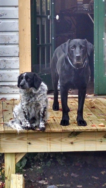
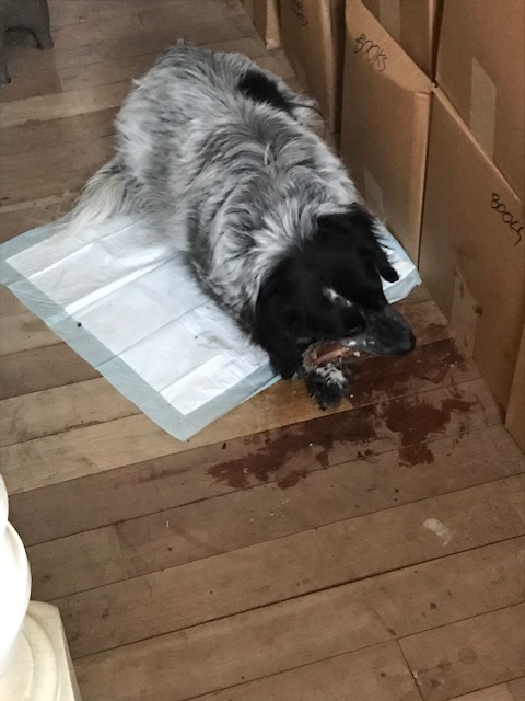
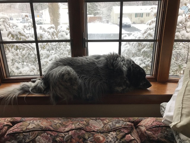
Roxie was the first of the trio of dogs I accumulated that included Lizzie and Gus. I got her when she was a mere slip of a girl—one and a half years old—and we’ve since had 8 and a half years together. Back then Roxie and I both had recently come through divorces. She got left behind in her backyard with a promise of regular visits and feedings that didn’t materialize. Luckily, the nice people at Precious Paws Animal Rescue fostered Roxie and found me to adopt her.
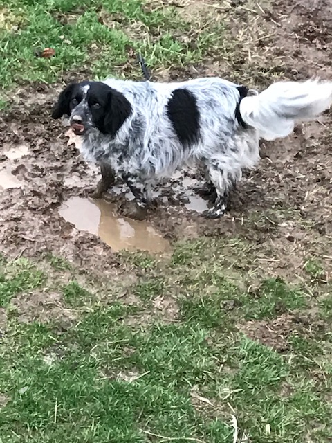
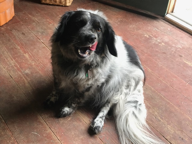
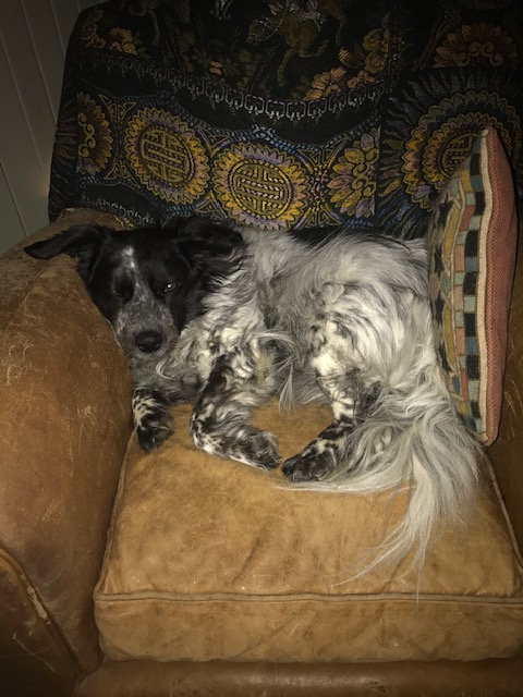
Roxie was spoiled. All my dogs are. She believed she was a princess and I never told her she wasn’t. She was a gracious royal: she allowed those around her to adore her. Roxie would slowly roll from a sitting position onto her back so anyone nearby could scratch her tummy. When we lived at my dad’s house Aunt Marian spoiled her (and Lizzie and Gus) with prime rib bones and white wine reduction sauce to top off her kibble. Roxie had no particular talents or skills except being adorable. She loved me whole-heartedly, just as I loved her.
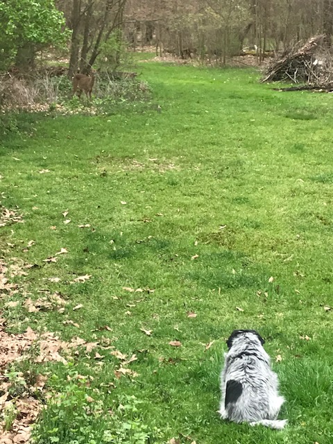
Except for that one time she and Gus took off to chase a deer all night, I could trust Roxie to stay in my backyard unleashed. Walks in the woods were at her own unhurried pace. She daintily dawdled and sniffed while I was hauled through the brambles at break-neck speed by my other wild-eyed hounds. Somehow she kept track of us and we’d all arrive back home at the same time.
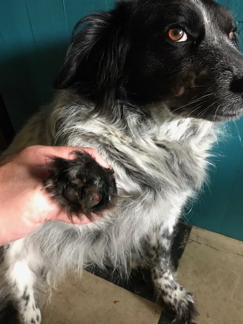
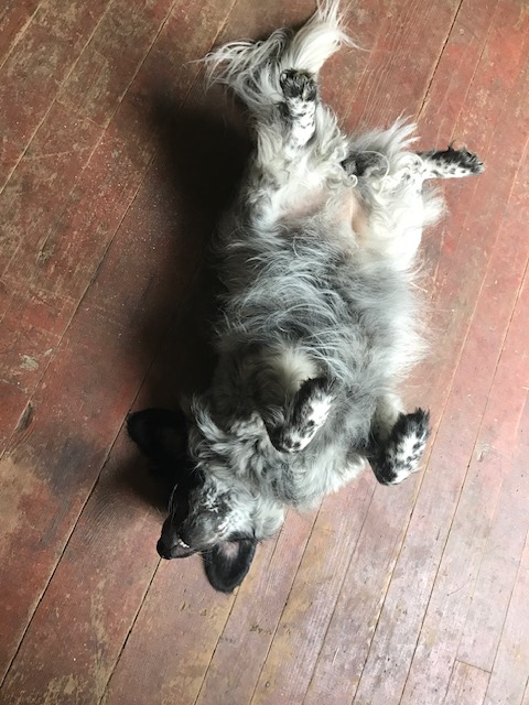
Lately our walks tired her and she had to rest frequently. This past weekend her breathing was quick, short pants. She couldn’t lay down or find any comfortable position. I called Dr Sandy early Monday morning and Roxie was admitted right away. X-rays showed her lungs filled with cancer. It had happened very quickly. There was no choice but to let Roxie go. Dr Sandy made her passing easy. I was with her to the very end—I held her and kissed her and looked into her beautiful eyes and told her I love her. I always will.
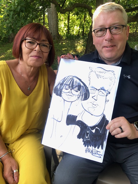
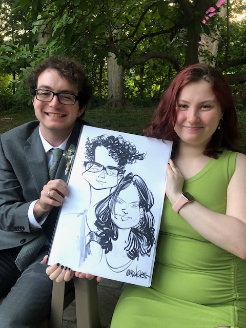
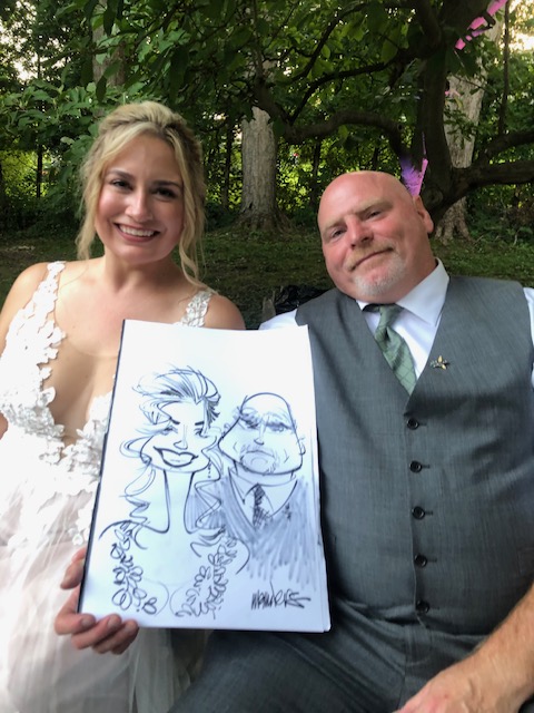
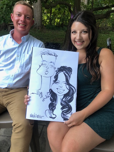
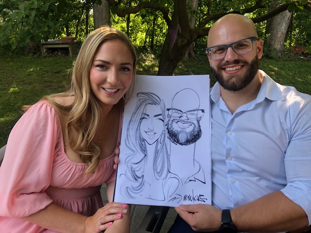
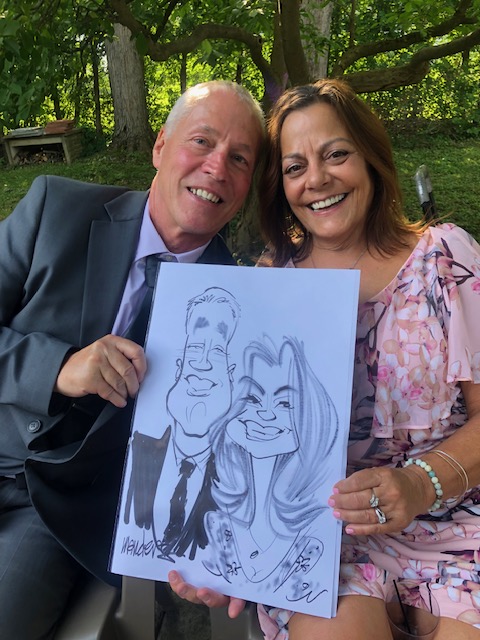
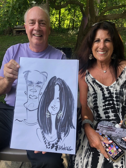
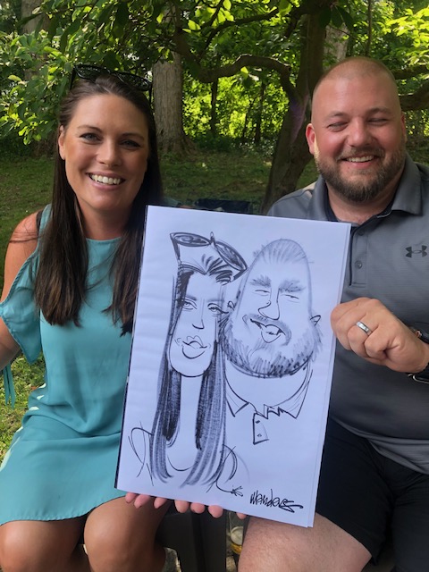
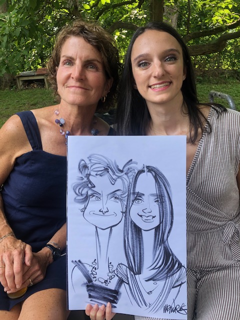
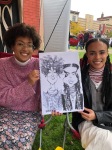
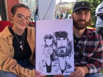
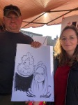
I’m so happy and grateful to say it’s been a busy summer! I’m especially thankful for my customers who hire me to draw their guests. What a fun crowd this was. Many thanks to my manager, Marie, who kept everybody moving and smiling.
More events are coming up—I’ll post photos as I take them. If you’re around Oil City, PA Friday-Saturday August 18-19, come get your face drawn at Bridge Fest!
It’s that time of year again! My little town of Franklin turned itself into the hub of Appledom for 3 days last weekend. My lovely girlfriend Marie managed the crowd and kept everything running smoothly with hardly any fistfights. Here are some of the wonderful people I got to draw. Quite a few return customers!—I’m so grateful.
Yup, that’s me! I’m the caricaturist Ms Arendt mentions in this clip. On Saturday, September 10th I’ll be drawing caricatures at an elegant fundraiser— the Hospice of Jefferson County’s Masquerade Ball at the Harbor Hotel in Clayton, New York. My manager, Marie, will be on hand to keep my operation moving along smoothly! https://www.witn.com/video/2022/08/29/jefferson-county-hospice-masquerade-ball/
What if you could make paper out of something cheap, that’s not cloth? Cloth rags are expensive. Cloth rags have fiber that can be made into a pulp. What else has fiber? I mean besides broccoli. Imagine living in North America—in Canada—and you’re surrounded by literal millions of big humongous huge growths that are nothing but fiber. I’m talking about trees. Pine wood is soft enough to break down into a pulp.
Paper from wood fiber is called newsprint—can you guess why? It was invented by Charles Fenerty, a 17-year-old lumberjack and poet. He figured that wood fibers would make decent paper. He was right. It was good enough to print newspapers on. Charlie lived in Canada, where they have tons of wood and lumberjacks to harvest it. The Fenerty family business was farming and lumber. They grew trees, cut them down, milled them and sold the lumber.
Newsprint is the name of the paper that newspapers are printed on nowadays. It’s ridiculously inexpensive. Newsprint is made out of wood pulp instead of rags. Newsprint turns yellow quickly because wood has a lot of acid in it. But that’s okay—nobody minds. Newspapers are only meant to be read once and then thrown away or recycled. Because newsprint is cheaper than cloth-fiber paper, printers can sell newspapers at a much lower cost. What’s that mean? That means more people can afford the newspaper.
Those newspaper printers wanted to make a buck. They needed to pay close attention to that ol’ bottom line. ‘Bottom line’ is a jokey way of saying what you get when you subtract how much you spent from how much you made. You get a bigger bottom line (more profit) by reducing what you spend.
Take paper, for instance. Paper is one of the expenses of printing a newspaper. Making paper hadn’t changed much since its invention. It was good stuff. Fiber from linen, wool and cotton rags was broken down into a watery slurry that got pressed into a gorgeous piece of paper.*
Paper must have been a big overhead expense for a newspaper operation in those days. Think about it—what happens to a newspaper the day after it’s published? It lines bird cage floors. Kids make hats out of it. British people use it like a cone to hold their fish ‘n’ chips. Nobody needs a newspaper once it becomes yesterday’s news. Seems a waste of top-quality paper, doesn’t it?
* I know all about it. I shell out extra samolians for rag content paper because it’s such a treat to draw on (I like Borden & Riley #37 Boris Layout Bond. I draw on it with a 2B lead pencil).
Back to the beginning of The Western Civ User’s Guide to Reading & Writing.
Don’t forget: I wrote another Western Civ User’s Guide! Back to the beginning of The Western Civ User’s Guide to Time & Space.
Newspapers provided news, information and opinion at a reasonable cost. As we saw in past cultures, the big-shots in charge like to exercise tight control on news, information and opinion. The early newspapers of the 1600s & 1700s had to be ‘authorized.’ Authorized newspaper printers were given permission to publish by the government. Maybe the government covered some of the costs of running an authorized newspaper. Running an unauthorized newspaper had some downsides. In England and her colonies, unauthorized newspaper printers were shut down by government officials, all copies destroyed and everybody who worked there arrested.
This happened to America’s very first newspaper publisher in Boston on September 25, 1690. Today, only one copy of that first newspaper—Publick Occurrences Both Forreign and Domestick—exists.